How to Use Cycle Time to Identify Bottlenecks in your team's workflow
Discover how mastering cycle time can transform your team's efficiency and productivity.
Introduction
Understanding and optimizing cycle time can significantly enhance your team's productivity and problem-solving capabilities. In this article, I'll share a method I've refined over the years, illustrating how a data-driven approach can uncover hidden inefficiencies and substantially improve team performance.
In my experience, 90% of the teams don’t include a data-driven approach in their regular practices and miss objective facts about their performance.
We'll focus on analyzing cycle time data to answer two key questions:
Do certain tasks consistently take longer than usual?
Is the average time to complete tasks gradually increasing?
This article provides a comprehensive guide on collecting the necessary data for your team, interpreting the elements of the graph, and determining the best times and methods for conducting this analysis.
Understanding Cycle Time vs. Lead Time
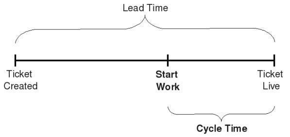
Cycle time measures the span from when work starts on a task to its completion, which is crucial for teams where tasks are interdependent, such as in software development or manufacturing.
In contrast, Lead Time or Time To Market (TTM) is used when team tasks are completed independently by different team members. For instance, an IT support team typically operates under Service Level Agreements (SLAs), contracts between the service provider and the user. Lead Time is often a key metric included in these agreements.
How to calculate cycle time
We will use a simple workflow example of a software development team:
InProgress > Blocked > Code Review > Testing > Deployment > Done.
We define:
Ticket: This is a piece of work that needs to be delivered by the team. Sometimes also called User Story or Task.
Cycle time (per ticket) = Total number of days from “InProgress” to “Done”
If you prefer to track this data manually and use a whiteboard with sticky notes for each task, add a mark on each sticky note for every day that passes. However, this article mainly discusses using web tools like Jira, which offers the benefit of collecting and storing historical data. This allows for more detailed analysis over time.
In Jira, you can follow these steps to see your team cycle time:
Go to your project page > Left side menu select Reports > Control chart.
You will see a graphic that includes many elements that we'll review in detail.
In this chart, the X axis is the date, and the Y axis is the number of days. Each dot represents one ticket, or multiple if the dot is bigger.
Now that we understand the basics, let's start by collecting the necessary data for our analysis.
Setting Up Data Collection
Before we start analyzing the chart, it's important to clean up our data by filtering out anything that isn't relevant. Here's how to do it:
Choose the Right Ticket Types: we want to look at User stories, other tasks, and bugs. We will exclude things like UX research, Project tickets (Epics), and Service Desk tickets, as these are not relevant to our analysis.
Select Appropriate Statuses in your workflow: Focus on tickets from the status 'InProgress' to 'Done'. These statuses show the active working period of the tickets.
Set the time frame: Generally, reviewing data from the past two weeks provides enough insight. But for a deeper look at long-term trends, consider examining data from the last 3 to 6 months, especially to check the moving average.
Exclude Outliers: You should leave out any tickets that don't accurately represent the team's actual work time. For instance, remove duplicate tickets that were resolved immediately or tickets that were delayed because you were waiting for an external response.
By filtering the data this way, you ensure your analysis is based only on the most relevant and accurate information.
How I do it in my teams:
I start with filters 1 to 3. I don’t exclude outliers, which means that the Average value can be significantly influenced by even a single outlier. The Median value, however, is more resistant to outliers, so it's more reliable to focus on that.
I will add labels to the tickets, for example, “UX research”, “Service Desk”, etc. This allows us to filter the data faster.
I mainly use Jira, so I will use Quick Filters to filter my data.
After our data is properly filtered, let’s clarify how to interpret it.
Interpreting Data for Insights
This guide will distinguish between the cycle time graph's crucial and less critical elements.


